Tuesday, October 18, 2016
Capstone Part 7: Buttons
I've created buttons for the main menu. Each button has 3 states, a unpressed, a hover, and a pressed version. The buttons essentially light up and hover every time the mouse hovers over. I've also created a ring for Saturn that has falloff. The reason why it has falloff towards the bottom is because of atmospheric perspective. When you're looking towards the horizon, you're essentially looking through more atmosphere than you would be if you were looking up.
Capstone 6: The Tank
One of my favorite parts of this whole project was to design the fuel tank. This acts as the HUD element to let the players know how much fuel they have left, while also telling them how fast they're going.
Number 1 was the original idea I had for the tank, and I chose glass so that the player would be able to identify the amount the of fuel. 2-6 are variations on this idea. 5-9 use a much more bubble like design for the fuel tank as they take on much stranger designs. 9 is the most alien of all of them, as it's built like a nest of glass bubbles, perhaps I'll keep this design in mind for a different project.
Ultimately, I went with 7.
Capstone Part 5: The Giants
The majority of our planets in the game and in the solar system are the gas giants, so I was able to knockout quite a few assets in one day. Our work around for there being clouds that you can land is that these clouds are pretty dense. The clouds are so dense on the Gas Giants that the closer you get to the surface, the denser the clouds. It's so dense, that it's like swimming in air.
For the design of the clouds, I just thumbnailed fluffy cloud shapes that looked appealing to me.
Capstone Part 4: Mars and Venus
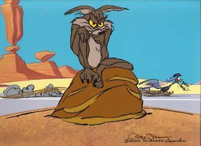
My favorite planets to create were the terrestrial Mars and Venus, as I really got to flex my design muscles and come up with various rock formations. Each one is inspired by the background rocks you'd see in a Looney Tunes cartoon. Very simple, very geometric designs.
Capstone Part 3: Craterous
I was tasked with creating the surfaces for the Moon, Mercury, and Pluto, as each are full of craters. The designs are fairly simple, just make a pit in the ground with jutting rocks to make it difficult for the lander to land.
Then it's just a matter of finishing them for the final game. I also made a moon background with a star field.
Wednesday, September 14, 2016
Capstone Part 2: Rocks
Perhaps the largest task I'll have during this sprint is creating rock assets for our terrestrial planets. Looking at retro travel posters for reference, the mountains and rock formations are very simple. Each has maybe 2-3 colors. My other big reference for these rocks are the backgrounds of the Wile E. Coyote cartoon, because they have really interesting formations.
Using these references, I drew up a series of thumbnails.
Capstone Part 1: Ship of Dreams
For our capstone class, we will be creating mini-games for a game called Kidscom. As the only artist in the class, it's up to me to create all the art assets. Our game is based on a Lunar Lander game where the player must land a ship on a planet without crashing, and my first task to create the final ship asset. Below are some thumbnails I came up with to create an idea of what ship could look like. To create a good thumbnail, a concept artist should use as little value as possible, that is, only using white, a mid gray, and black. These three values create a very readable image, because our eyes immediately pick up shadows and uses those shadows to create form.
1 and 2 were drawn from retro sci-fi movie posters, sort of the classic rocket ship. However, most of them looked pretty similar and not like a lander. For 3-5, I tried more of robotic drone look, and while I think they look good, they didn't fit the aesthetic of retro-futuristic. 6-10 fit the aesthetic the most, as they feel very Jetson's or Marvin the Martian. 11-14 are some of my favorites as I tried to combine elements from all the other ships, but they look too shell-like. In the end, number 7 was chosen to be the final asset.
After choosing our final ship design, I took the thumbnail into Illustrator to create a final vector image. I haven't used Illustrator in quite sometime, so this was rather difficult, but after a few hours, I managed to finish the asset to my standards.
Subscribe to:
Posts (Atom)